This will be my mock up of my film poster a rough version but on the ILP we have no mac or computers with photoshop
http://www.battlemouth.com/wp-content/uploads/2010/07/Scary-room.jpg
Wednesday, 17 November 2010
se7en

Se7en - Director David Fincher
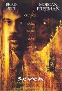
A film of the thriller genre, which will apply directly to my project, has the title in clear sans serif text identifying the title immediately, the text is iconic to the film genre and with the rough harsh texture in the background instigates a gritty film. Thriller tends to keep simple sans serif text throughout and as shown in this poster the main actors shown prominently at the top of the screen which can draw attention from fans and enhance the films status, slogan under the title "seven deadly sin. seven ways to die" addressing the narrative and indicating the plot. down the centre of the page the sins are displayed reinforcing narrative.
One aspect that tends to lend itself to all genres are having the pictures of scenes and actors cut and cropped from actually footage of the film, actors looking into the camera again interacting with the viewer,both Brad Pitt and Morgan Freeman emotionally have a sense of shock worry and intent on there face which is thought through by the designers to convey the emotion and mood of the film.
codes and conventions of the thriller genre poster that i have found or feel i should incorporate:
. title in centre bottom of the page
. production crew and promotions at the very bottom over black drawing as little attention as possible
. font depict the target audience and genre i.e sans serif is more masculine and is used in the thriller genres
. colour and style schemes again link narrative
. slogan depict narrative
. date of realise shown
. certificate
. the posters must have an effect on the audience draw attention and sell the film
thriller genre - film poster
Each genre has its own style of film posters, within the thriller genre there are many sub genres be it physiological thriller or action thriller e.c.t, my film would be a sub genre - physiological thriller.

This poster has very dark negative space with again the title centered at the middle bottom of the page, the writing is in blood red linking the narrative with the killing disturbing nature of the film, The main objective of a film poster is to provoke a reaction drawing attention and promote the film. by having the main character in a sinister grin again looking into the camera (synthetic personalisation)drawing attention creating a connection. Thriller films tend to relate to narrative strongly and create a sinister slightly mysterious cover putting engage the audience in a state of interest - investigation into the film.
combining the codes of conventions i.e title prominent in the center of the page production actors crew in the bottom in a different less distracting font, over black, big actors in bold.
film poster reaserch

film posters use conventions to gain an effect on the viewer, the poster themselves are advertising therefore they must engage and promote the film so audience go and spend money either in the cinema or on dvd.
The poster will indicate genre narrative character and depict a mood and style, to this the designers will use font colour lighting character photography and possibly slogans.
font is key there are two types of font serif and sans serif, serif font are typefaces with flicks and more of a famine curly design. sans serif is a font without any elaborations flicks and curls it is generally masculine and used in action film for impact. with the use of font the designers can clearly engage the target audience for example Law Abiding Citizen directed by F. Gary Gray uses bold sans serif font because it is a action exsposive film where as The Wedding Planner directed by Adam Shankman has elegant serif font to appeal to females, there target audience.
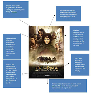
points i made from this poster
.The release date is clearly stated at the bottom of the page for audience information
. The film introduces the majority of the characters, which gives a familiarity in the trilogy of posters
.Font is a key convention to film posters; this is a serif font in a medieval type depicting history time and age linking the text to the narrative of the film
. Again the colour and tone reinforce the traditional age old feel and connotes the narrative and location of the film
. One convention that is seen in all movie posters are a list of the actors crew and production companies as well as promoters
. Title – large centre of the page. Draws attention clearly indicates to the audience the film instantly
. Synthetic personalisation is used to interact with the viewer creating a direct connection as the characters look at the viewer
. Film posters use effects to add a professional clean cut appearance, in this case mist and lighting show a air of mystery and adventure
Friday, 12 November 2010
animatic feedback
in class we had a group discussion on each of our animatics and how we could all improve and what aspects of the animatic were good and effective. for me this was a use full process and was something i needed to gather development, i was told by my teacher and peers that i needed to introduce more shots and the pace was far to short and quick. for me it hard to draw and animate a pov shot with no cuts which is a integral part of my film, but i will go away and think of how to over come this for example draw points as the camera maneuvers.
Tuesday, 2 November 2010
animatic
i had trouble adding the correct and useable music, i will ad the music and sound effect with in a day or two to improve verisimilitude and develop a better picture of the product.
Subscribe to:
Comments (Atom)