Thursday, 9 December 2010
film review
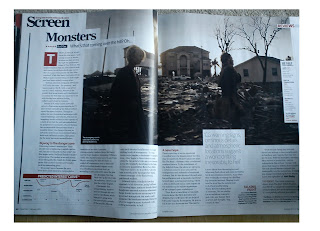
This is a film review for the new film Monsters directed by Gareth Edwards, this is a classic layout for a film review on a double page. A main image is used to depict both film and narrative, text and add on's are placed around the image with some overlapping, again colour schemes are added titles in red and a star rating is a concept that is used in all reviews, The text moves around the centre image much like this blog post which keeps the text in columns for an easy read and a simplistic view.
Total film have introduced a predictive interest curve which has a graph with a line of interest which adjusts to the viewers interest throughout the film this is one aspect that is different, its a novelty and add a extra view on the film these concepts vary in magazine and could be something i make up and adapt into my own review be it a predicted curve line or a related idea.
This is an example of how reviews will pick out a key quote and put it in bolder text which for one gives the reader an initial feel for the text but also can draw readers in depending on the quote, i will use this technique and as they do change the font colour and size to draw a reader.
Again a unique quality to this magazine and review is that the writers have put a indent of other films related to this one that readers might enjoy, because of the similarities with the both.
By looking at this review the thing that stood out for me was the curve line and the other films that viewers would enjoy, this is a concept i will definitely incorporate. The writing style has an air of humor and relates to its reader the mood is not so in depth and tries to appeal to wide range of social backgrounds and people film is global and the reviews must apply to this, the columnist strays of on points which link to the film to give a wider range of view and reading combining opinion with fact.
Moving on reviews often use actresses and actors cast and crew alike to question to give a brief lighthearted question and answer interview, questions are in bold black and answers in a lighter smaller text, an example of these are :
. What will make this a must see in 2011?
when doing a question and answer extract for my review i would question Leah my main actress, and ask similar questions such as
. What did you think of the concept behind the film ?
finally here are examples of reviews in the same magazine just giving a variation in review layout but i will stick to the above.
Wednesday, 8 December 2010
film review
Another aspect i need to do for my project is an ancillary task, which involves producing a movie poster and a writ en review. To do this i need to research both movie posters and reviews which i have done and now i am moving into the film review.
Today i went out and brought Total Film where i have read different reviews looked at composition and writing styles. i will go through different aspects and look how i can incorporate things into my writing and review both in imagery layout and text.
As you can see colour is used into the design with the titles in red and the information in black simple text, this gives it a effective break and division. Quotes are used in a larger text to give readers an immediate feel of what the text is about and what is said, one thing i thought was interesting is how the text is put into a box and the box is adapted to the white border giving it a professional slick look.
final location
I have finally found my location to film after thinking through different mise-en-scene factors i have picked my own house partly because of the lack of time and difficulties to find the perfect location as well as set backs i had after deciding on one location that fell through due to permission.
This location works well in that it can depict past, its a home with decoration and seemingly happy it works well as a family home and by showing past and present i can clearly reinforce the idea of an event that happened which in turn forces the house to become derelict and reflect two different time periods.
this location will be seen first as the audience encounter the event showing how the house has life the middle part of the film will use this location to reflect how inanimate objects have life and the walls have seen life and situation that are harsh and troubled towards the end part of the film the other location will come into play ,as seen in the previous blog post, resembling a lifeless setting and connoting time pastures.
for the past location my house i will change some appearance in that colours i will try to make dull and more sinister objects will be replaced to reinforce the narrative and the house will need to be cleared of all UN wanted objects that can stray from what i want to convey.
film poster composition
Tuesday, 7 December 2010
locations
i have found three locations this first one is for a before and after shot, it is a house, previously a mental institute and is run down shut out with metal frames , on the brick work keep out is sprayed on with paint as the wood and plants around are dyeing and unkept. This gives for a strong level of mise-en-scene and donnotes past and danger, for this location i was planning on filming some tracking shots to show a house with age and link the idea of life within an inanimate object in this case a house, carrying the narrative.
the location is easy to film uneven ground but overall easy to get to and no permission is needed to use here are a few pictures that reflect the above
practice
I filmed by cousin's freestyle one to help him but also gain experience and practice using a hand held technique. overall the filming went well and was pleased with the smoothness and variety of framing, one thing i could improve was if i could hear the track before hand i could adapt the camera movement into parallel motion with the sound.
Subscribe to:
Posts (Atom)